This site needs enough range to hold a product decision, a half-finished thought and a working system without turning into three different websites.
The answer is not more decoration. It is a small set of formats, used deliberately.
Plain text stays the default
A fieldnote can be one sharp paragraph. It does not need a diagram, a framework or a lesson at the end.
The work should feel close enough to inspect, but quiet enough to think next to it.
Longer notes can use headings, lists and links. The typography carries the page. Everything else interrupts it on purpose.
Callouts mark a change in weight
Callouts are not cards. They sit inside the reading flow and change the pressure for a moment.
Decisions should be inspectable
| Question | Decision | Why |
|---|---|---|
| Language | English | It matches the products, references and people the work is meant to reach. |
| Default form | Short fieldnote | A thought should not become an essay just because it is published. |
| Visuals | Evidence before atmosphere | Screens, diagrams and artifacts need to explain something. |
| Motion | Feedback and continuity | Movement should make state or interaction easier to understand. |
Tables work when comparison is the point. They should not become a layout shortcut.
Artifacts bring the work closer
An artifact needs a caption that tells the reader what to notice. If the caption can only say that the image looks interesting, the image does not belong.
Images show evidence
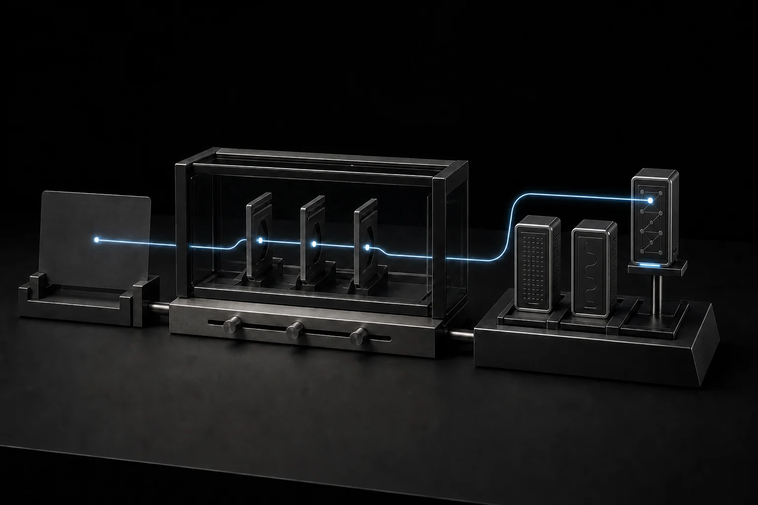
An image should show the product, the system behind it or the tension that shaped a decision. Atmosphere alone is not enough.
Inspection can be playful
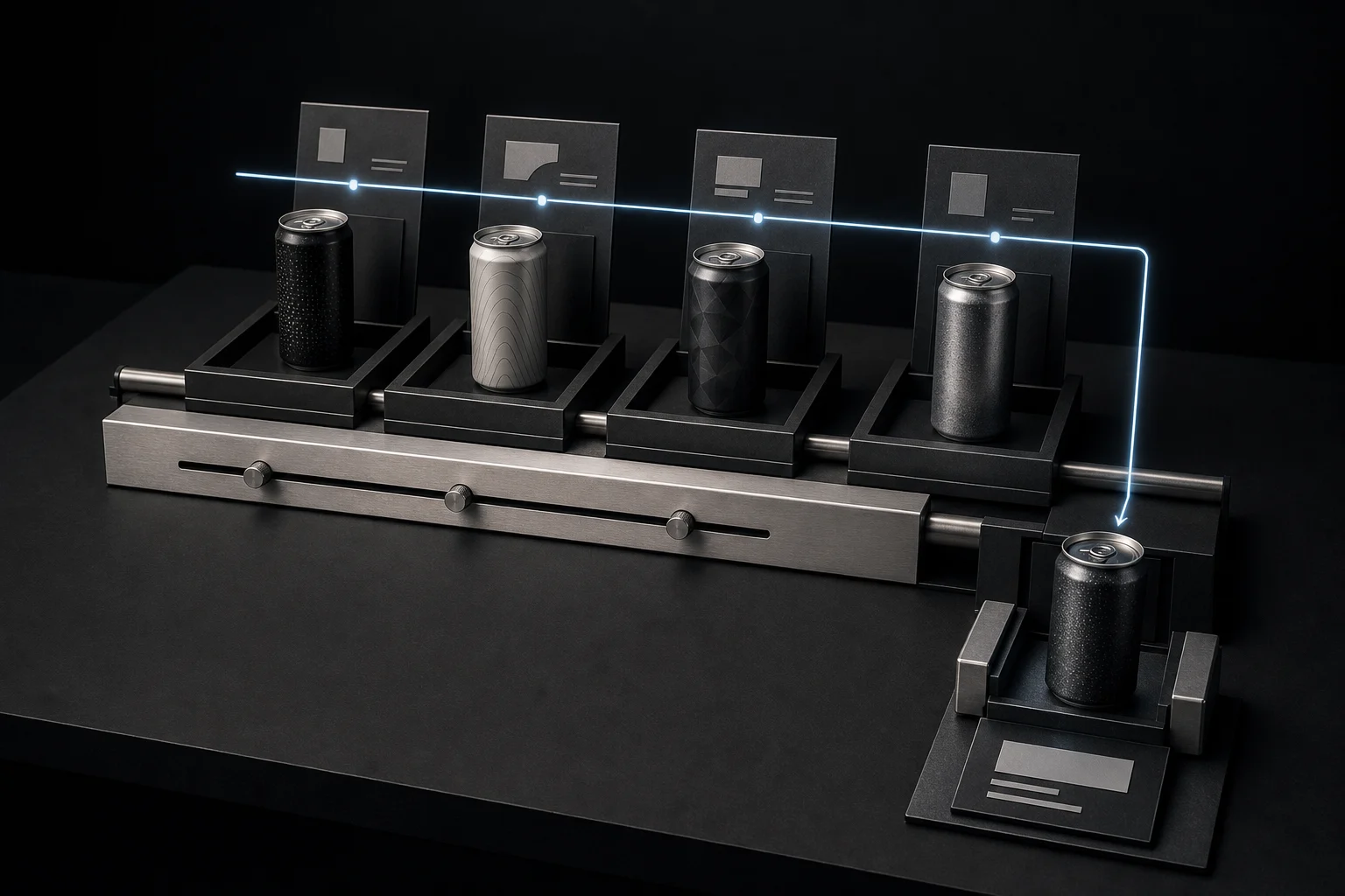
Hotspots let someone inspect a project image without turning the page into a product tour. On desktop they respond to hover and focus. On touch screens they respond to taps.
SVGs explain structure
SVG graphics use the same grammar as the interface: near-black surfaces, thin neutral lines and soft white type. Attention comes from contrast, not a neon accent.
Charts keep one signal
Charts are for comparison, change and proportion. If the number can be understood faster in one sentence, write the sentence.
Process can become a sequence
flowchart TB
  Q[Question] --> T[Test]
  T --> D[Decision]
  D --> A[Artifact]
  A --> N[Note]
Sequences explain movement through a system. On narrow screens they become vertical, never compressed horizontal timelines.
Code is evidence too
.interaction {
  transition: transform 180ms cubic-bezier(.23, 1, .32, 1);
}

@media (prefers-reduced-motion: reduce) {
  .interaction { transform: none; }
}
Code belongs when the implementation is part of the idea. A small excerpt is usually stronger than a full file.
The same block can carry terminal commands, diffs, JSON, prompts or source code. Language and filename stay visible. The copy action stays quiet until it is needed.
- visuals: atmosphere
+ visuals: evidence
Files can stay attached to the thought
An attached file can be a PDF, dataset, prompt, export or source document. On the published site it should show a useful name, format, size and a clear download action. This demo only reads the local filename and size. Nothing leaves the browser.
Deep links connect thinking and building
A project can point to the exact note behind a decision. A note can return to the exact part of the project where that decision became visible.
See how Theo keeps continuity between runs
Read the note behind that system
The link text should say what waits on the other side. “Learn more” says nothing.
The system stays small
The useful set is plain text, callouts, quotes, tables, artifacts, diagrams, code, footnotes and deep links.[1]
That is enough range. New formats only enter when an actual piece of work cannot be expressed clearly with what is already here.
Images can be real screenshots, interface crops or generated evidence. The style stays consistent, but the image still has to carry information. ↩︎